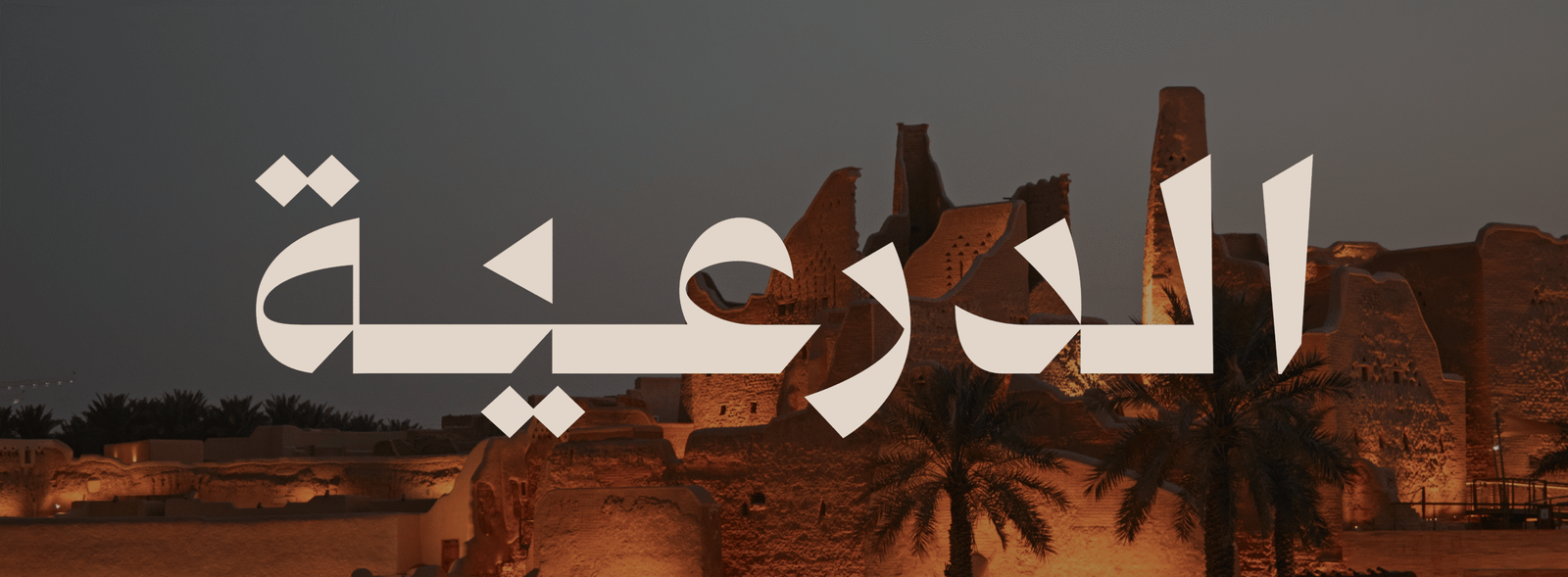
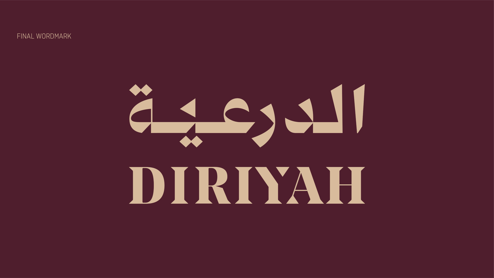
Diriyah Wordmark
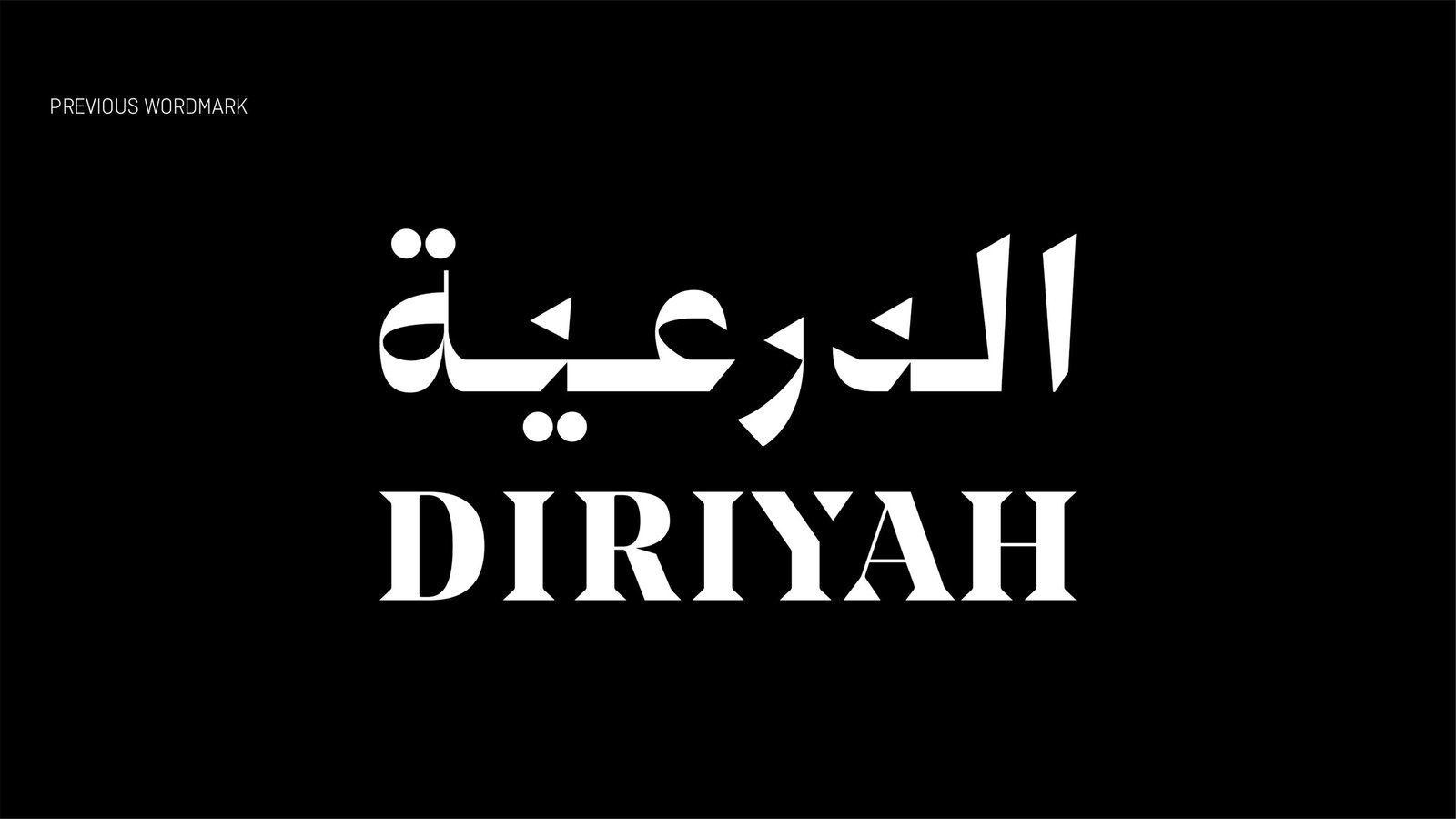
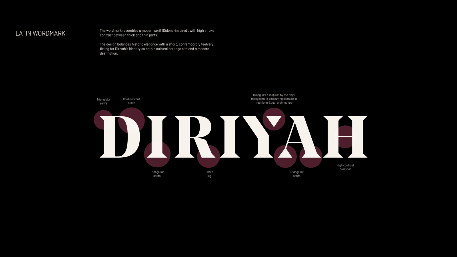
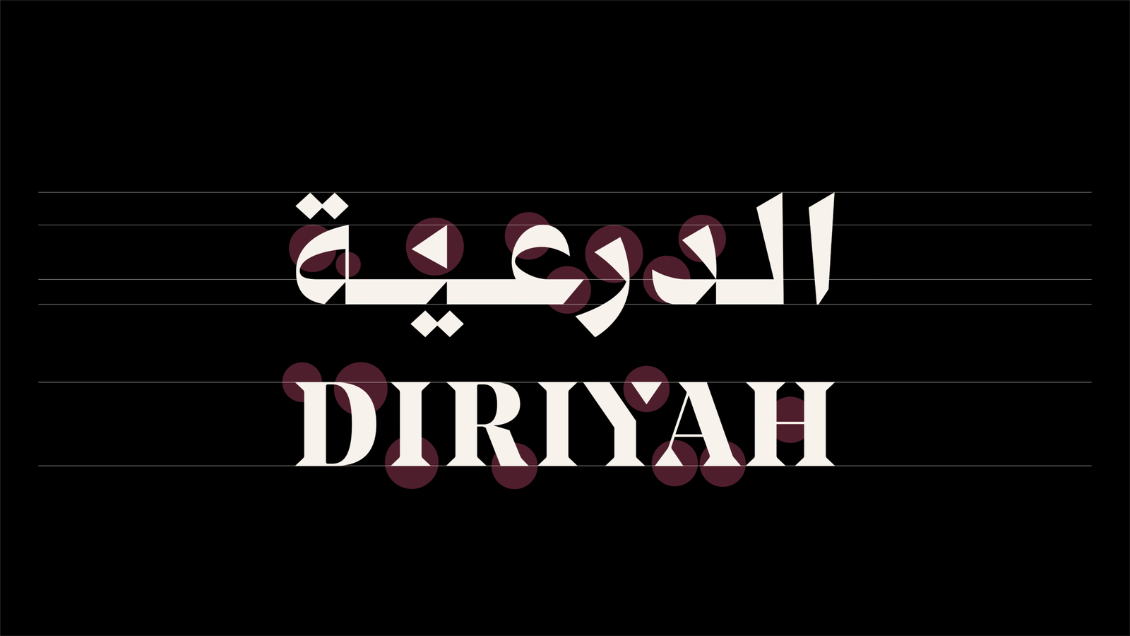
At ALMASBAK, we worked on the development of the Diriyah logo to refine its visual identity and emphasize the unique character of the Arabic script. The project focused on enhancing the details of the Arabic letters to better reflect the spirit of Diriyah and its deep cultural and historical significance, while maintaining harmony with the Latin counterpart.
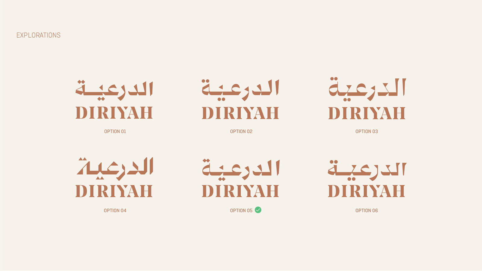
The goal was not to make a radical change, but rather a thoughtful evolution that builds naturally on the existing identity. Throughout the process, we explored multiple design directions and iterations, striving for the optimal visual balance between Arabic and Latin.
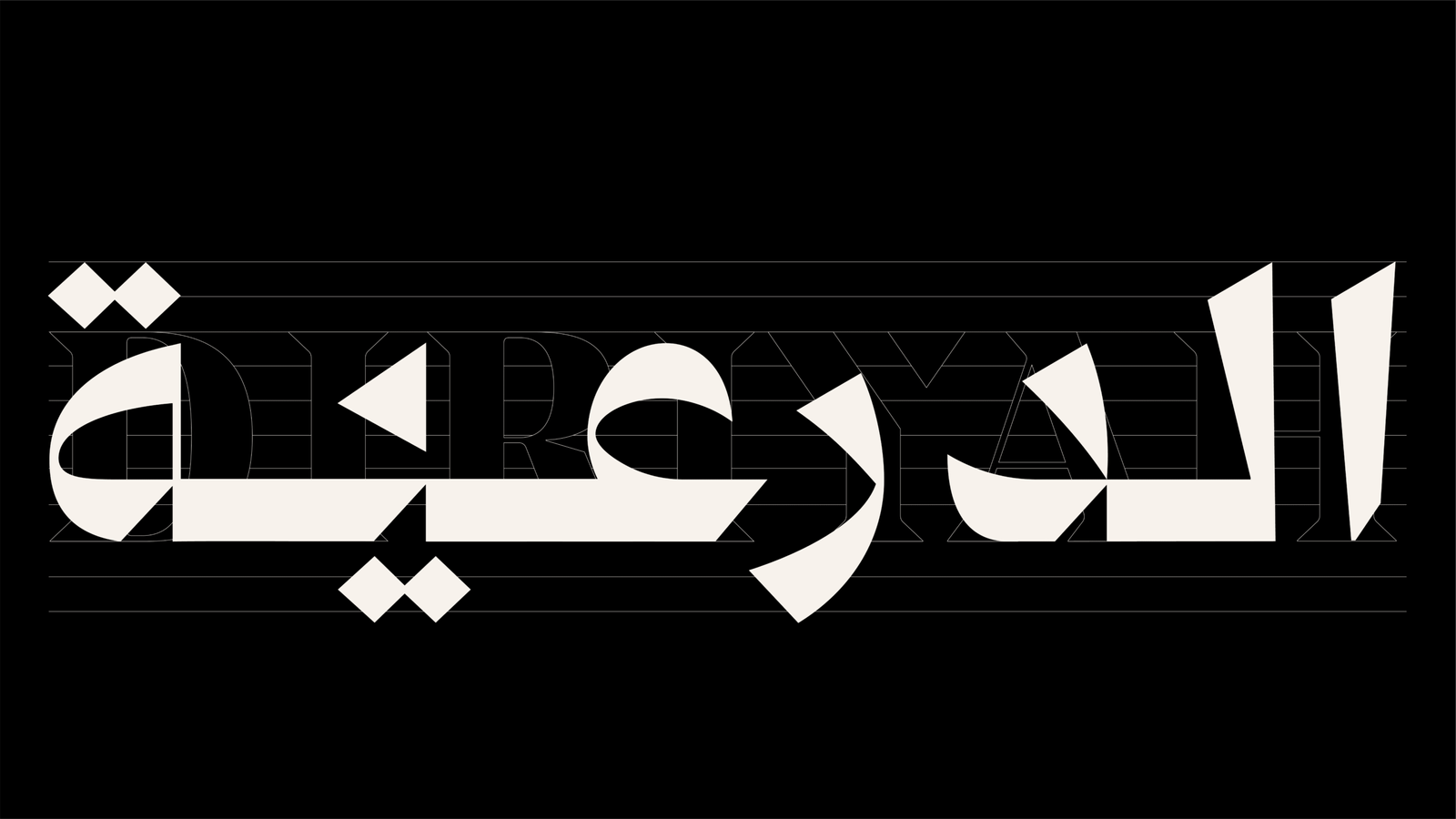
Careful refinements were made to the letterforms, ensuring the Arabic script felt distinctive and authentic—not merely a translation of the Latin design.
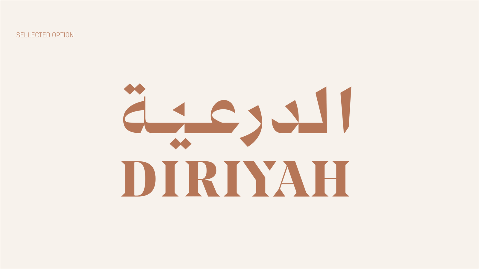
The result is an evolved logo that achieves greater visual coherence between Arabic and Latin, giving Diriyah a more consistent and unique identity across applications. This development allows the logo to more clearly express Diriyah’s essence as a destination deeply rooted in heritage yet modern and forward-looking.